Animation has just as much of a capacity to create powerful art as film does. People frequently express surprise at how they were moved to tears or left with a deep emotional attachment to pixels on a screen, but it’s probably because pixels are empty code that they’re such capable vessels for pouring all of our feelings in.
On Thursday, Mitski shared the animated music video for her excellent Be The Cowboy cut “A Pearl.” A visually stunning piece of animation, the clip is also supremely effective at making your heart feel a plethora of things. A Mitski-like figure runs through a maze of houses, before falling through a dream space; we never actually see her face but the turmoil, and urgency is palpable. The first quarter of the year isn't even over, but "A Pearl" is already a strong contender for the best video of 2019.
The Spotify-commissioned video is composed of 1,480 individual frames, and co-created by designers and animators Saad Moosajee and Danaé Gosset in conjunction with Brooklyn-based music video production and direction studio, Art Camp. They made the video over four months last year using a unique method that combined traditional illustration (painting, sketching, etc.) with digital editing and rendering. They also listened to a lot of Mitski. Below, a conversation with all three parties on how this truly sublime work of art came together.
How did the concept of the video come together?
JOS DIAZ CONTRERAS (ART CAMP): The guiding concept of this video was an image that Santiago and I both shared when we listened to the song: a small character – Mitski, but not Mitski – flying through an untethered universe on an abstract emotional journey. The lyrics are very visual, and it was tempting to try to illustrate the imagery, but we chose to focus on the feelings contained in the song instead of the words. Not that we didn’t make dozens of animations of floating pearls.
Once we knew the basic concept, Saad and Danaé spent months animating tests and creating the images — ripping through fabric, falling sideways through an impossibly long house — that we then matched to different moments in the song. The raw emotion in Mitski’s vocals and guitars is so powerful that we had to keep pushing the visuals to try to match them. Finally, it was Mitski who suggested incorporating the ocean, which gave us the ending we were looking for and really brought everything together.
SANTIAGO CARRASQUILLA (ART CAMP): The vision for the narrative of this animation was Mitski falling off the edge of the earth — like a flat earth suspended in space. We wanted the fall to be very long and emotional, a physical drop to represent the rupture of one’s heart of one’s soul.
What kind of reference material did you consult?
MOOSAJEE: One of the first references that was given to me was from Mission Impossible: Fallout. There's one scene where Tom Cruise jumps out of an airplane — a really long shot of him falling through the sky. It's a technical achievement, none of it green-screened or computer-generated. Tom Cruise actually jumps out of a plane. That was given as a reference of what it feels like emotionally for a person to fall in a strenuous scenario. We also watched the video for “Geyser” quite a bit, because she has a lot of emotional release and energy in that video. That was really something we wanted to bring to the character.
I’m sure you guys also listened to the song a lot, too.
MOOSAJEE: You know how Spotify does that Your Year in Review? Most of us had [“A Pearl”] as the number one song.
 Photos by Santiago Carrasquilla

How was the work split to make all 1,480 frames?
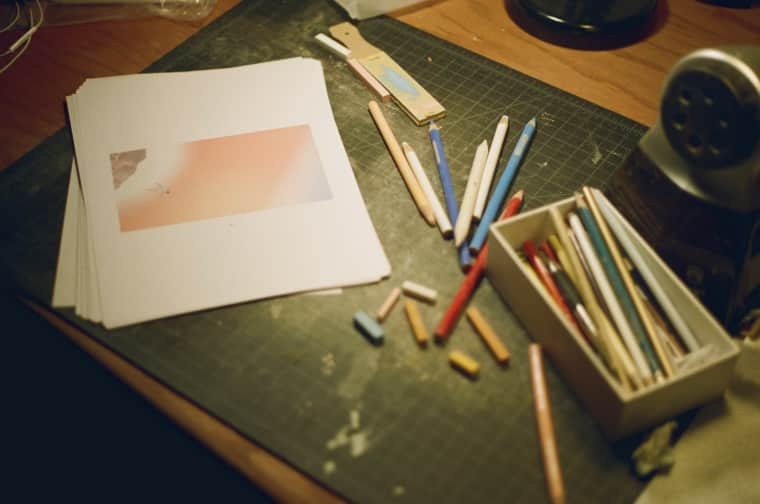
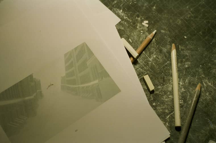
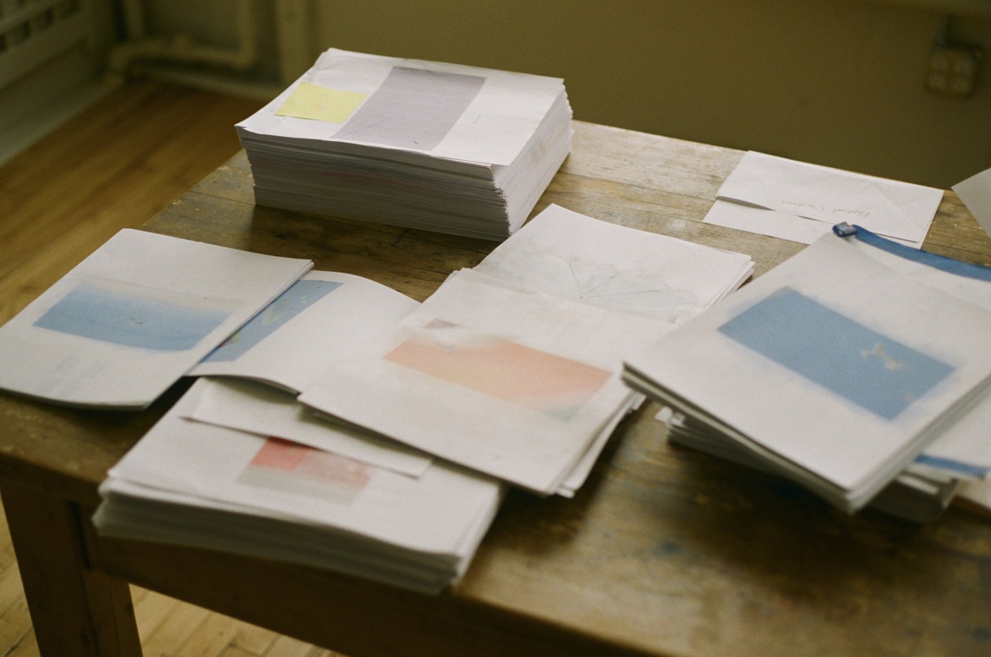
MOOSAJEE: We had two workflows — the digital side and the traditional side. For the technical process, I'd animate and design these images on the computer and we'd print it out on normal paper — something we could work with in our studios. [Gosset] would essentially illustrate that as a printed image, and [we'd] eventually bring that back into the digital edit.
What were the traditional mediums that you ended up using for the video?
GOSSET: Charcoal, paint, dry pastel, oil pastel, ink, and colored pencils. It was always about finding this unexpected balance between the two techniques — 3-D vs. traditional. Understanding the subtleties [of the traditional mediums] didn't always call for a heavy hand, but when it did, I found it was important to foster its physical qualities.
How did you choose the color palette? Were there any artists that influenced the illustration?
GOSSET: The color palette I used is quite close to the colors of the prints. I was often trying to blend the mediums onto the print. There weren't any initial moodboards, but the old school [animator] guys such as James Whitney, Norman Mclaren, and Len Lye were huge inspirations as far as experimenting with techniques.
What was your favorite part of the video to animate?
MOOSAJEE: I really like the scene in the beginning where she goes into the house and it's kind of calm, and then the guitar hits really hard. The whole thing starts to come alive and revolves around her. That's when she starts running through it, bursting out of the house and jumping off. That was a really fun scene to work on because it was so much about the music and the feeling of the song, and trying to put that into the character.
Was everyone on the team familiar with Mitski?
I actually don’t think anyone on the team was a fan of Mitski. We all knew of her. We listened to all the albums, but we obviously listened to Be the Cowboy the most. One interesting thing I found is just that none of us got tired of the music, somehow. No matter how much we listened to it, it was always good.

