World Cup action ended last month, but that doesn’t mean we’re done taking a deeper look into soccer’s on-field styles — some of which have made their way into some of your favorite brand’s new drops. One item in particular that’s on the path to becoming a fall wardrobe necessity is the goalkeeper jersey. On the field, goalie jerseys are typically long-sleeved and rely on a high-visibility factor in both pattern and color choice, making them the brightest uniforms on the field. Off the field, brands like Palace, Billionaire Boys Club and Gosha Rubchinskiy have put their own spins on the item, turning it into a fall streetwear staple.
One goalie who was well known for his in-your-face jersey designs, was Mexican goalkeeper Jorge Campos, an active player from 1988-2004 for teams including Pumas UNAM, LA Galaxy, and the Mexican National Team. At 5’7, he wasn’t exactly the ideal height for the position, which on average was 6’3. While most keepers at the time opted for head-to-toe getups in lowkey solids, to pump up his own intimidation factor and throw off his opponent’s concentration, Campos donned neon-colored kits with dazzling geometric patterns that were influenced by his childhood in Acapulco. He even designed a few of them via his own company, ACA Sport (named for Acapulco), through which he was able to partner with team sponsors like Umbro and Nike, having their labels sewn into already made kits. Read on for a breakdown of a few of our favorite Campos kits.
1. 1995 Nike Pumas UNAM
Campos designed most of his own kits, and his PUMAS jersey (seen above), like most of his jerseys, incorporates bright colors representative of his hometown Acapulco’s surf culture.
2. 1994 World Cup
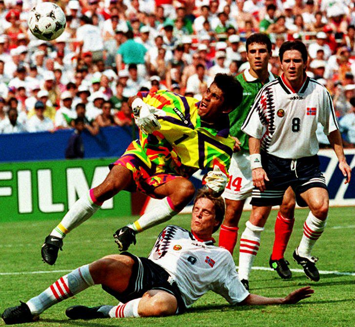 Photo via STF / AFP / Getty Images
Often denigrated by the press for his flashy dress, this fluorescent and psychedelic-patterned kit was deemed one of the worst uniforms of the 1994 World Cup. Considering the current appeal of hi-vis trends like neon colors, bold patterns and iridescence, these critiques didn’t hold up too well over time.
3. 1994 World Cup pt. 2
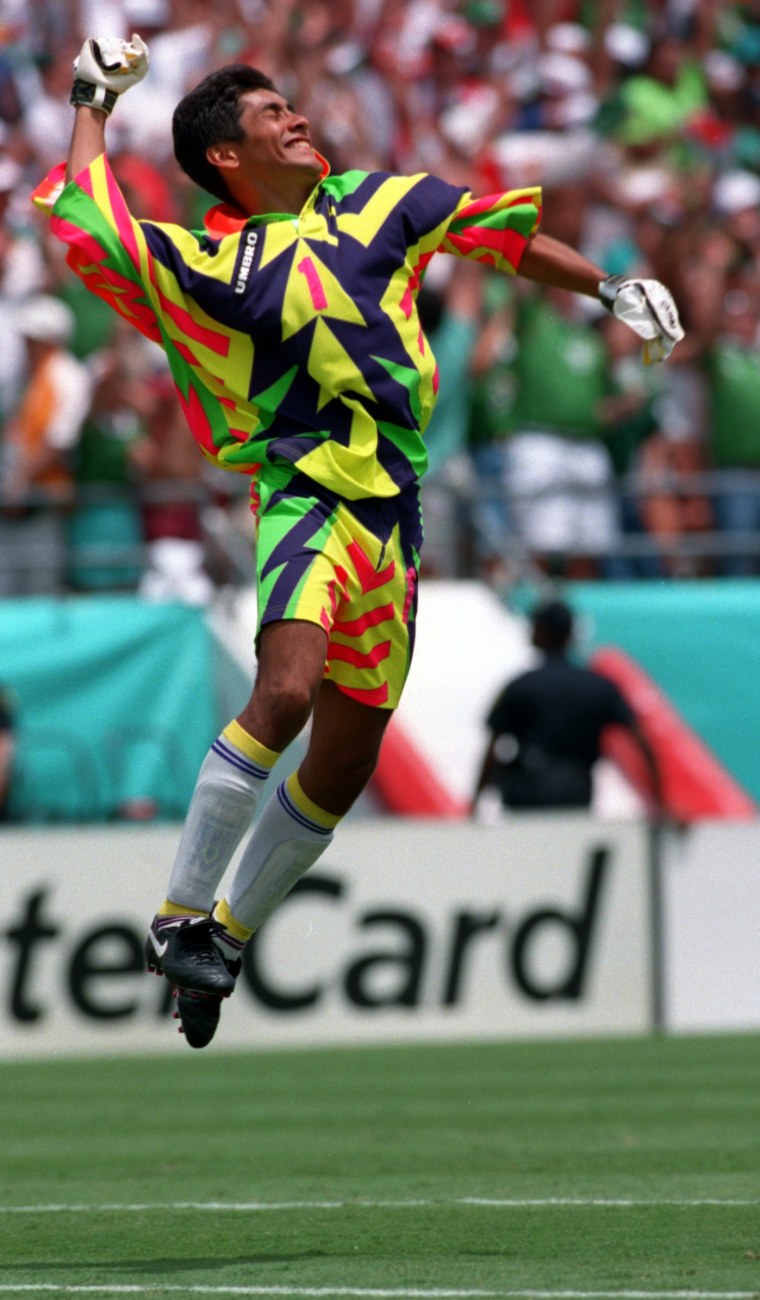 Photo via Billy Stickland / Allsport
The second option to the previous kit, this particular jersey of Jorge’s became iconic in group stage play when Mexico tied against Italy, the eventual World Cup runner ups. The neon colors contrasted with the deep purple and opposing arrow shapes make for a head turning design.
5. 1995 Tokyo friendly match kit
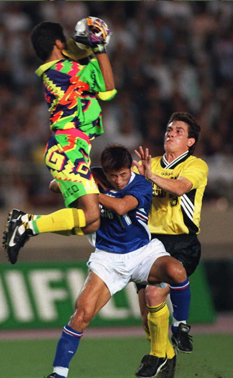 Photo by Kasuhiro NOGI / Staff.
Another Campos-designed Nike offering. This jersey integrated the colors of Acapulco surf culture and paired that concept with modern abstract takes on ancient Mayan shapes and patterns.
6. 1996 Gold Cup Mexico kit
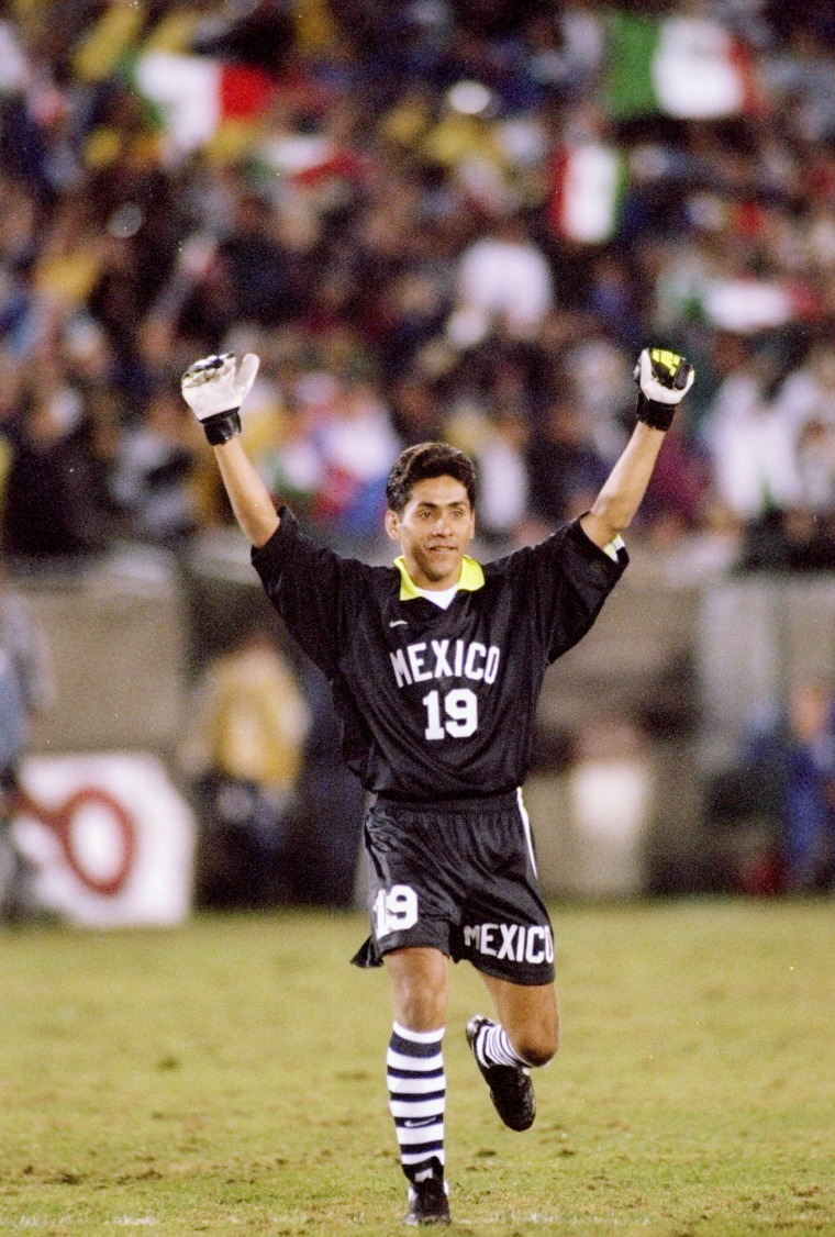 Photo via Mike Powell / Allsport
Much more subtle than other uniforms shown, this kit is still very striking with highlighter accents and knee-high horizontally striped sock that looks like the ancestor to designer Kim Jones’ recent soccer capsule with Nike.
7. 1996 Gold Cup Mexico kit pt. 2
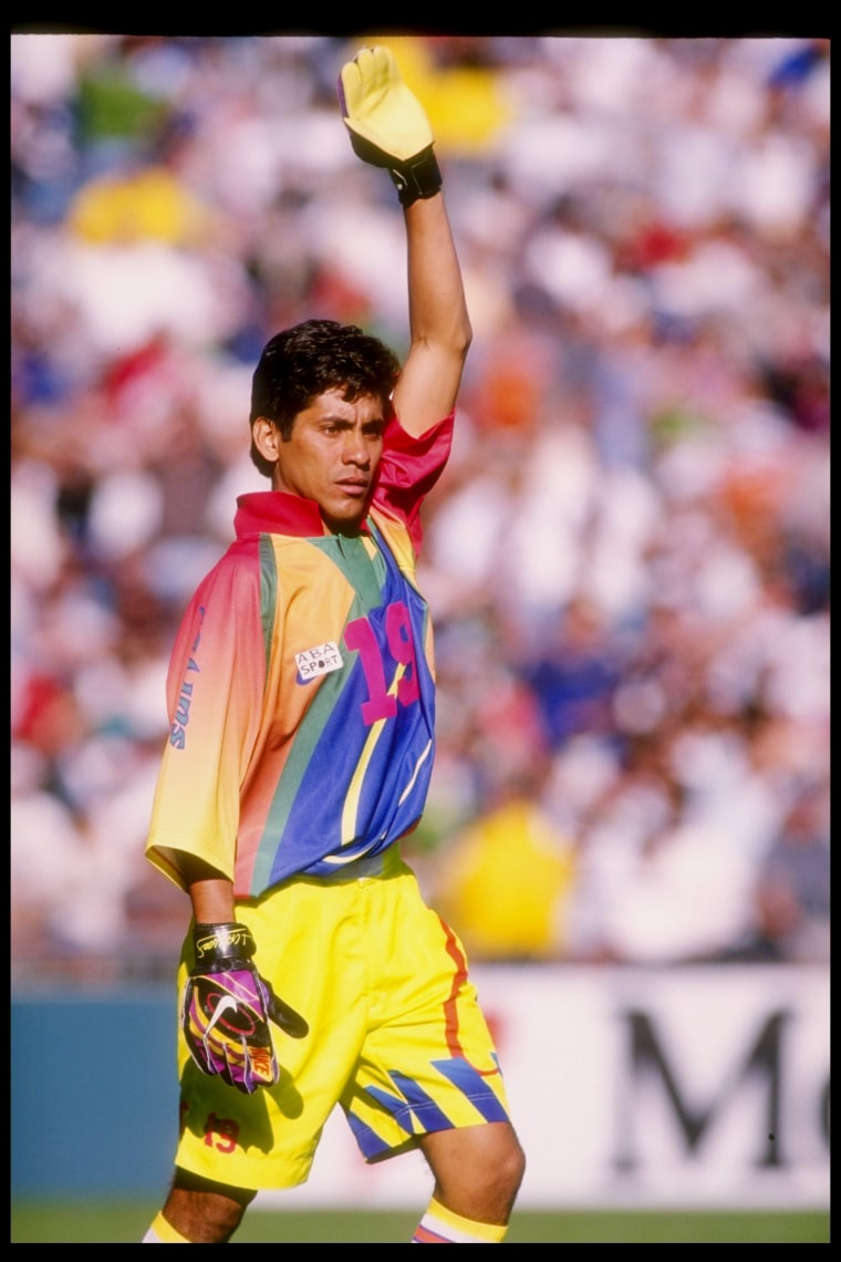 Photo via Stephen Dunn / Allsport
Focusing on the shorts of this uniform, the seemingly haphazard placement of numbers, words and geometrical figures are reminiscent of the deconstructed design trend we see today in brands like Off-White.
8. 1996 LA Galaxy kit
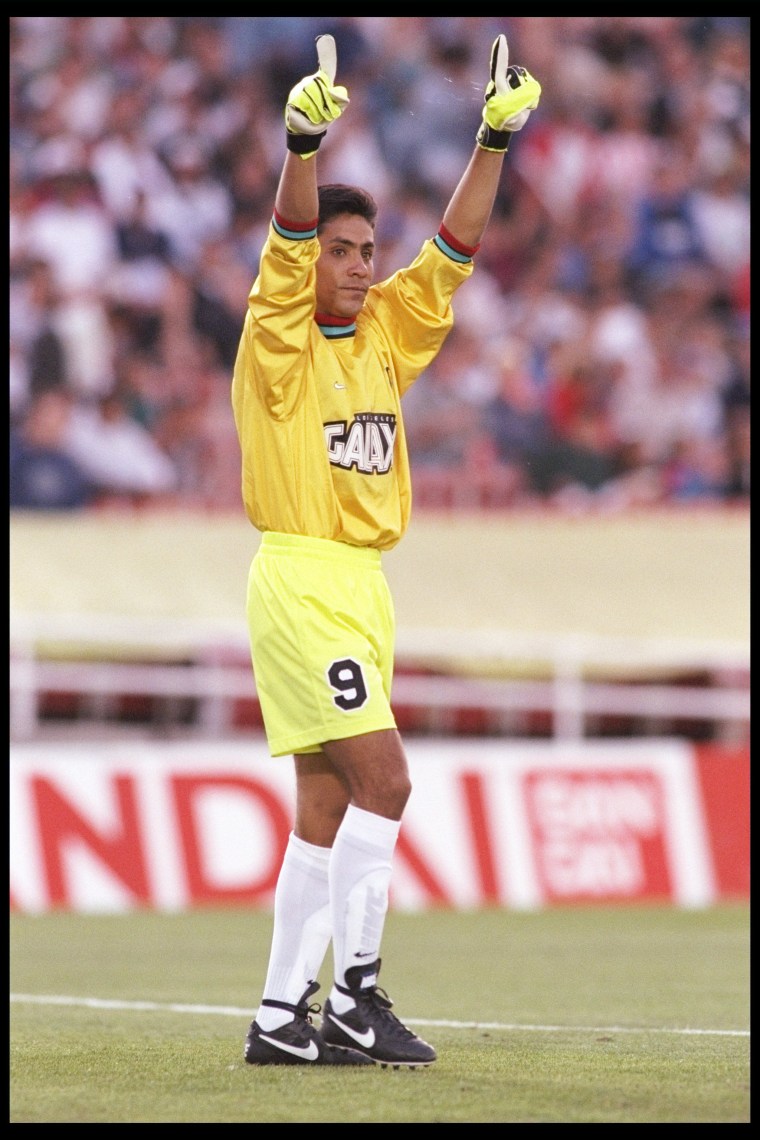 Photo via Getty / Jed Jacobsohn / Allsport
Campos’s stint with The Galaxy was short-lived, but he didn’t leave before making a statement with this all-yellow jersey accented by a brightly colored mock neck and cuffs that, once again, paid homage to his Acapulco upbringing.